*All images are recreations and illustrative only due to NDA.
Internal System Incorporation
Enabling internal upgrade of vendor system
Timeframe
3 months
Role
UX Designer
Team
Myself
Company
Novo Nordisk
Problem
One of the internal systems purchased from a third party vendor needed a overhaul with regards to information architecture, as new users had trouble finding what they needed. The vendor system lacked a design system or any documentation for default behaviour of the UI elements causing the UX designer on the project to not be able to work properly. In addition the system also suffered from UI elements of the exact same type and state having multiple versions with slight differences in size and color across the system.
Approach
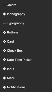
I was tasked with making the design system by extracting information from the systems HTML/CSS. Firstly, I made a general overview of atoms, molecules, components that needed to be made by going over the system one screen at a time. Colors, typography and spacing were defined at this time by reading those directly from the CSS. Colors were given a hex code, a quick description of usage and a name. Typography was written out using the font, weight and other parameters so designers would have a reference. Each were also given a name and description of usage.

Afterwards the components and their variants were built by going from atoms and molecules. This process was done by starting the examination of each element from the children and moving up through parents until the element was built. The same child/parent relation was then recreated in Figma with the goal that developers could reuse code more easily if the componets were built in a similar way under the hood in regard to structure, states and resizing for smaller screens.
//Image of HTML parent/child and the creation in Figma for a 2 parent/1 child - 3 table containers
While creating the components, they were also standardised. As most changes were minor, such as fields ranging from 300 to 400px or borders being defined with both #ccc and #ddd, most decisions were made based on the context of the component. For sizing, a size was chosen that would be able to show the user selection or input while not taking up more space than needed. For colors, the context and color of surrounding elements and background decided the final decision.
Solution
The final result was a complete design system consisting of a component library and guidelines for color, typography and spacing. The library was then handed over to the UX designer with a presentation of the design system. As my employment shortly after this project concluded, the exact benefits of the design system are unknown.